

Beauty Brand Development | Brand Guidelines | Identity | Logo Design | Digital Design | Social Media Playbook | Packaging
Gwyneyth was already making an impact with her lifestyle newsletter Goop, but she really wanted to bring that laid-back, chic style to the page. We landed on a minimalist aesthetic for the design of the book, paired with delicious, rich imagery. The photography telegraphs easy abundance and the feeling of a life well-lived. This was a preview of the laissez-faire luxe that Goop's now known for.
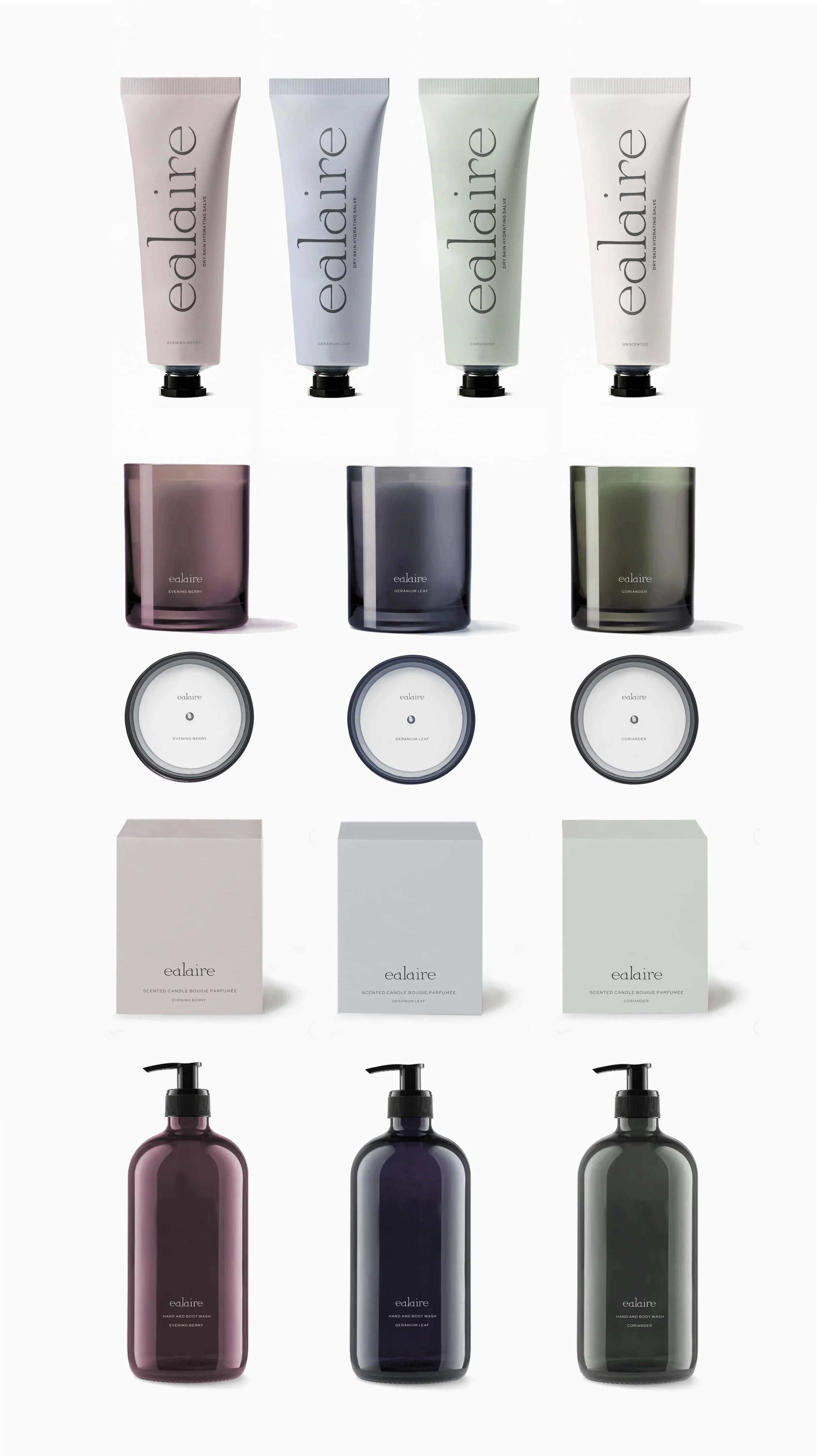

Utilizing stock packaging wherever possible. The solution focused on a palette of rich jewel and berry shades to add a custom element to recognizable forms for scented and fragranced products. And classic black matte and gloss for non scented products.
The guidelines include a custom color palette, with each color name—like Glume, Lignin, and Bolete—inspired by botanical terms. This naming convention gives our palette a natural, cohesive feel.
The new branding is designed to work seamlessly across all of ealaires’s many applications, both in-store and online, from carrier bags and pacakging to its website.
The design team used letterforms inspired by the vintage wood cut typography to create a custom typeface Ealaire Display. Although idiosyncratic and crafted, it still feels effortlessly modern.

